
BRAND STRATEGY · IDENTITY · EDITORIAL SYSTEM · DIGITAL HANDOFF
The Joyous Edge
Building a leadership brand as a system — not a single artifact.
The project began with a strategic problem: how to turn an abstract leadership philosophy into a system people could understand, remember and use. The organizing progression became EDGE → Awareness · The Edge → Decision · Executive Elevator → Execution, supported by the positioning language “See clearly. Choose intentionally. Act strategically.” From there, the work expanded into identity, messaging architecture, brand standards, editorial storytelling and production guidance that another designer or developer could carry forward.
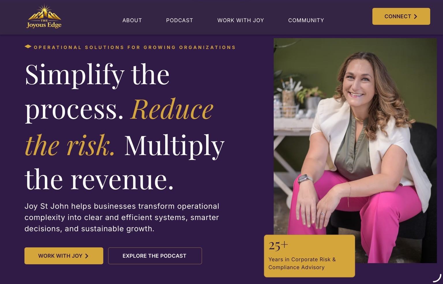
CLIENT BRAND ENVIRONMENTThe Joyous Edge · plum + gold
The purple field below is intentionally contained inside the Saint John green case-study frame. It represents the client brand, not the Saint John identity.
00 · THE STRATEGIC IDEA
From philosophy to a usable framework.
Rather than beginning with decoration, the identity grew from a sequence of human actions: awareness, decision and execution. The visual system gave that sequence a memorable structure, while the brand language kept the promise concise: see clearly, choose intentionally, act strategically.
Brand System
Messaging · Handoff
designer could build from
01 · BRAND SYSTEM & HANDOFF
From identity to usable authority.
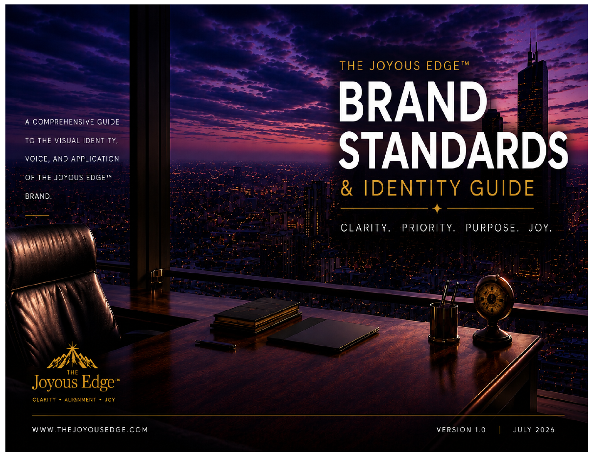
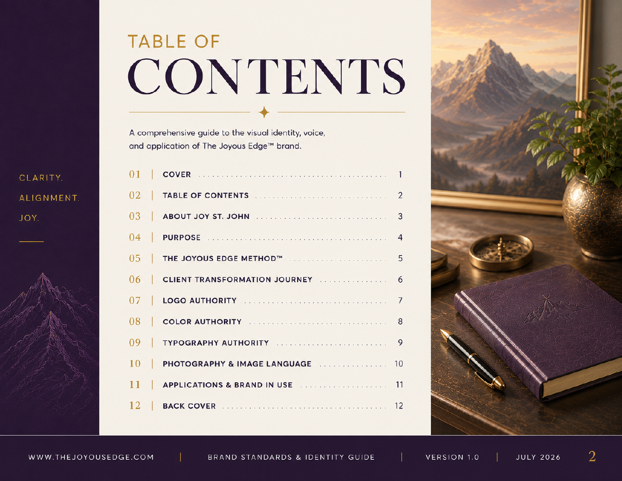
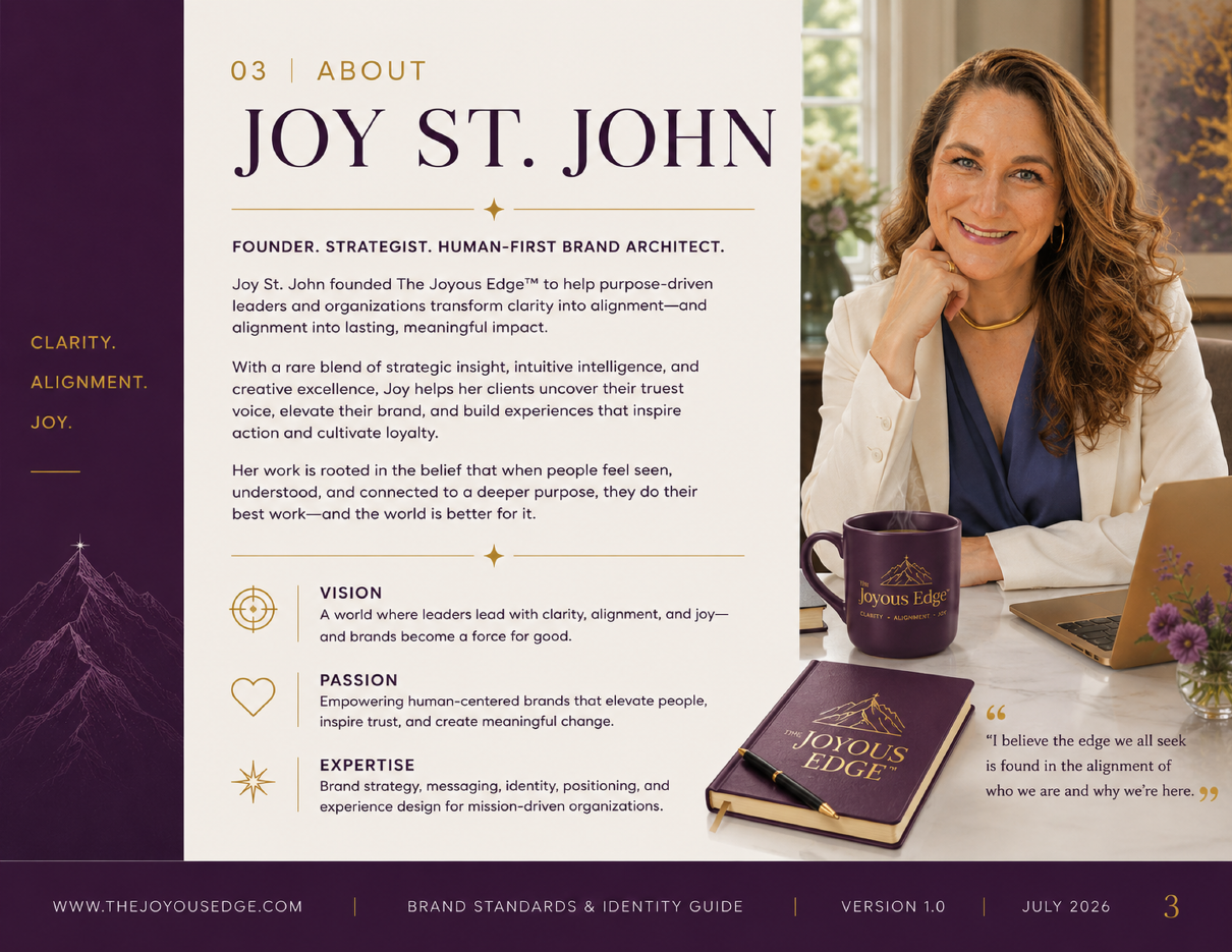
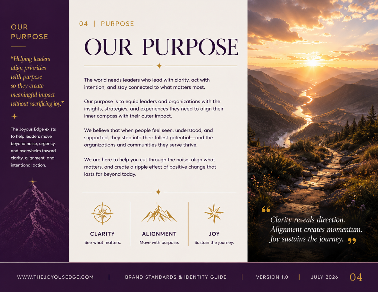
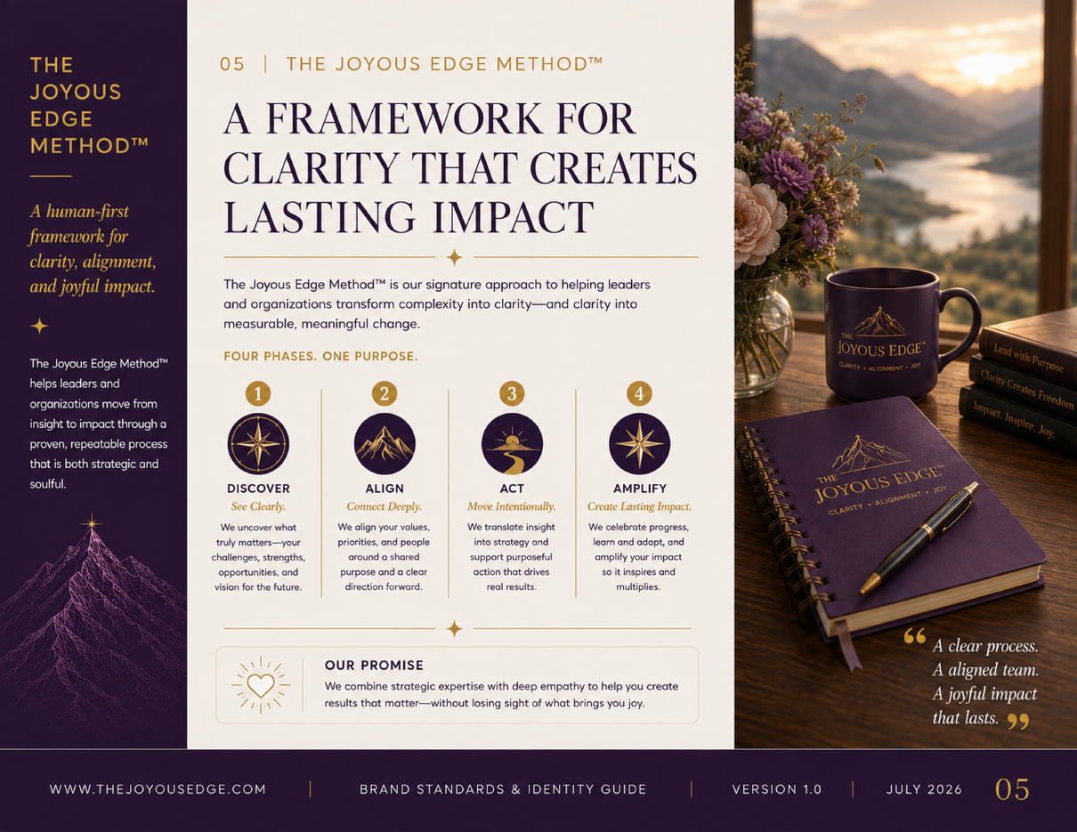
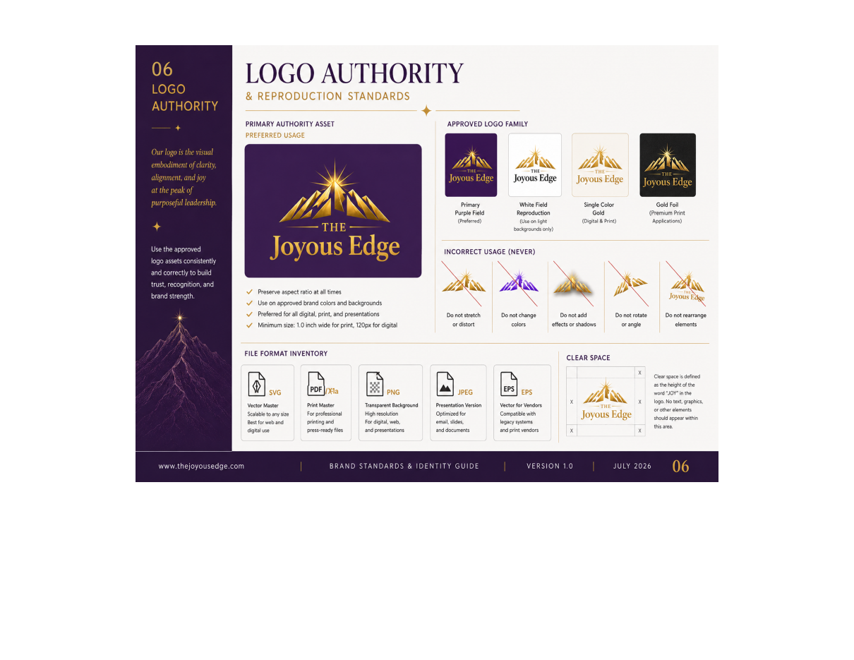
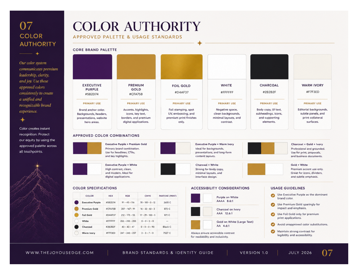
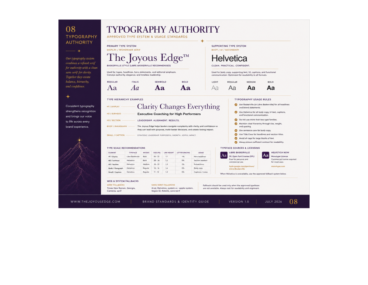
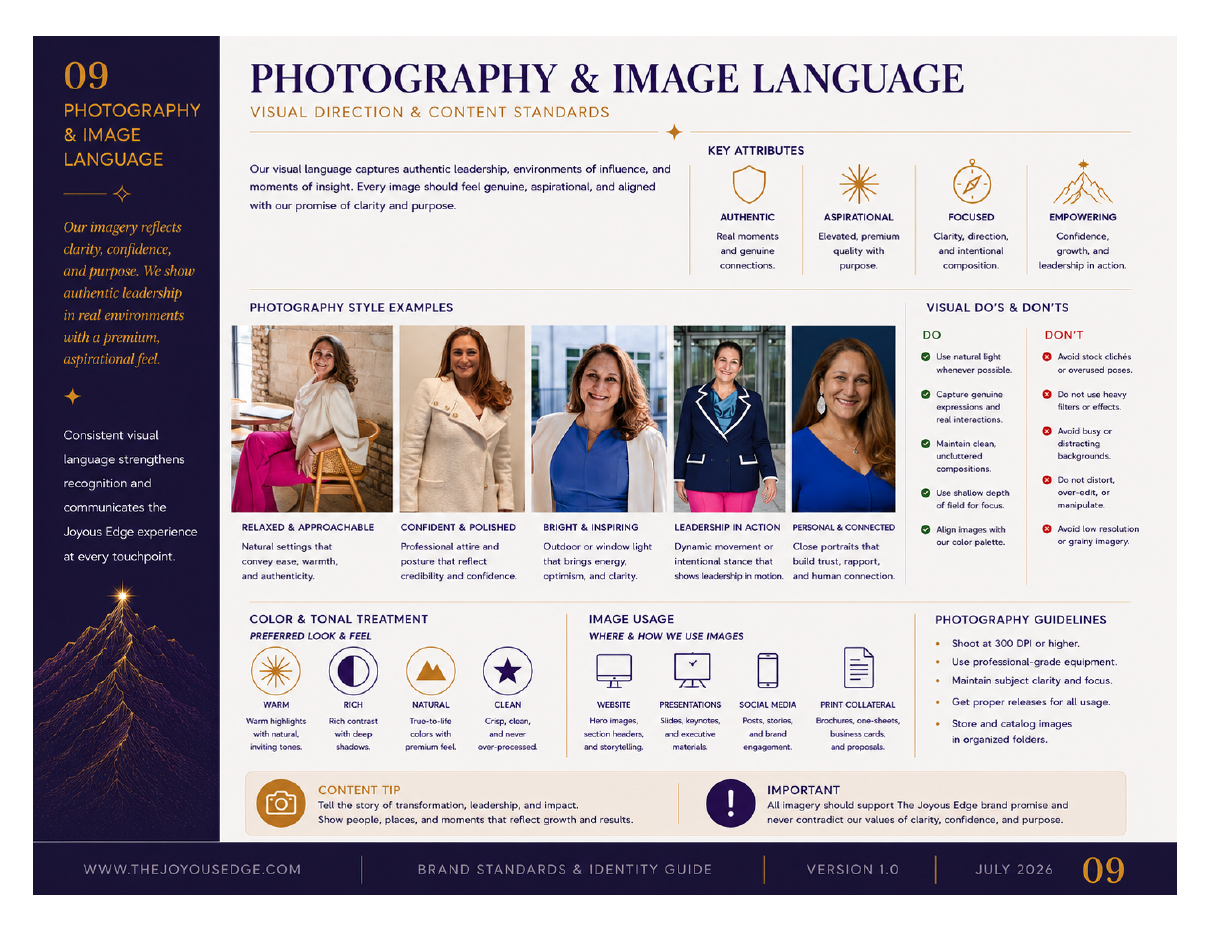
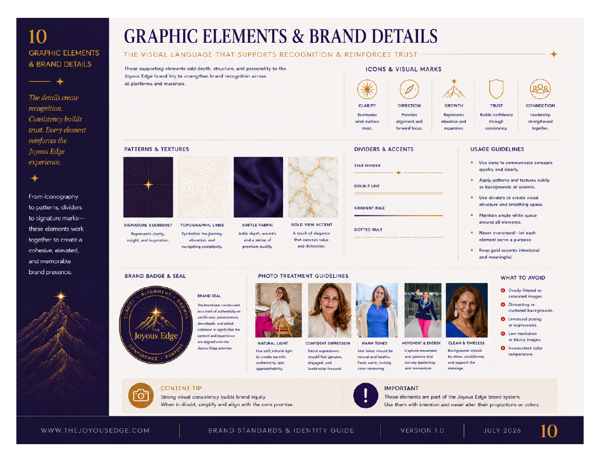
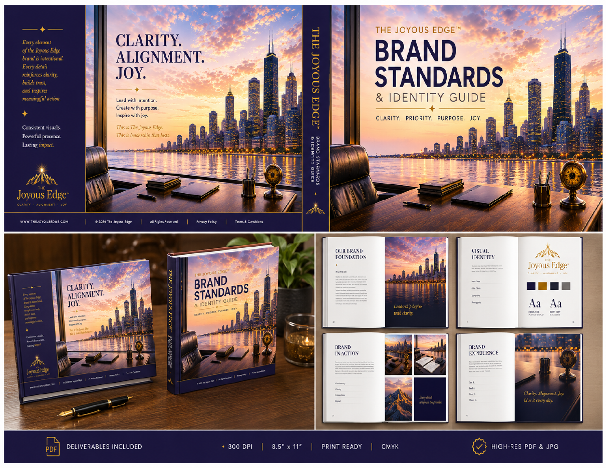
The recovered Brand Standards & Identity Guide shows the work as a coordinated handoff system: founder presence, purpose, method, logo authority, color, typography, photography and application. These pages are presented as evidence of the system behind the website.

02 · DEVELOPMENT
The work before the answer.
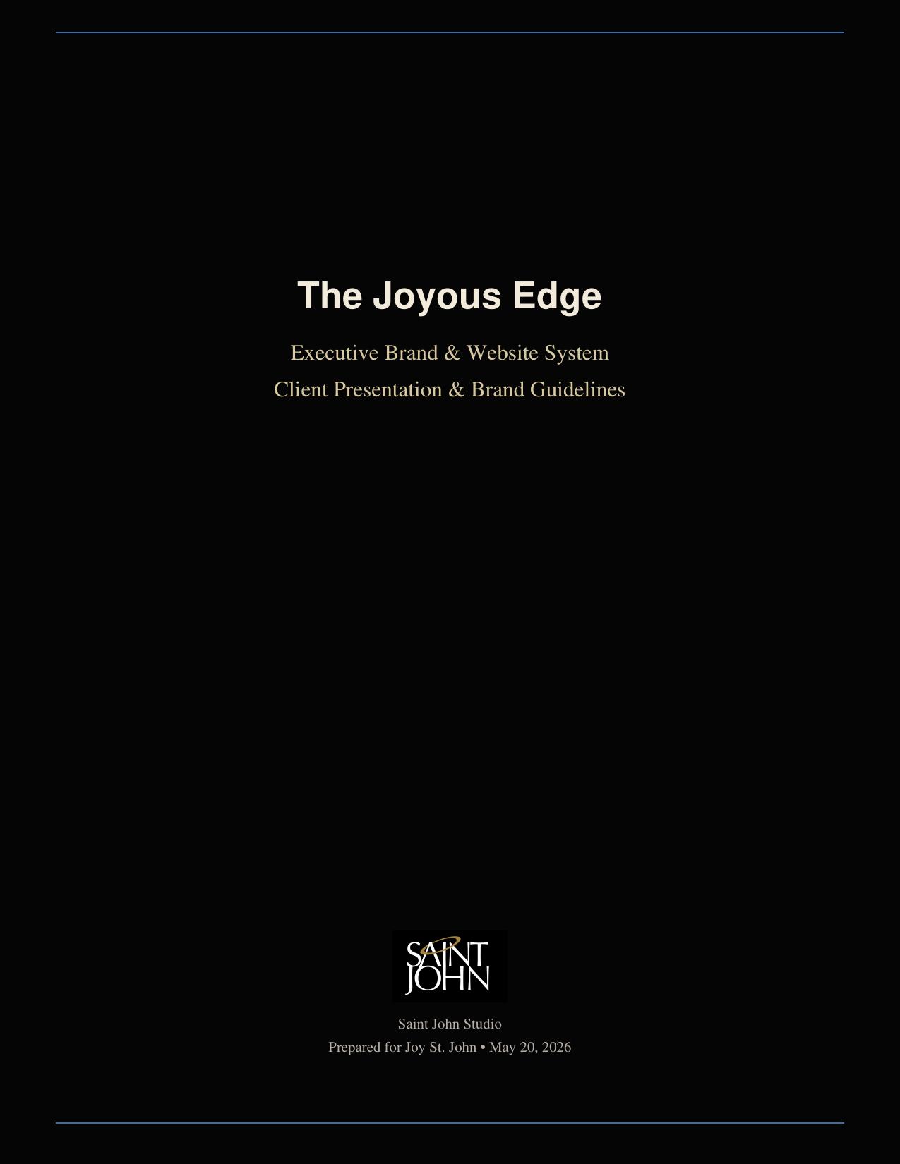
Earlier publication and presentation explorations are shown as process. They document how the visual language and editorial rhythm were tested before the system was consolidated. Development is labeled as development — not final client authority.
03 · HANDOFF
Open case-study PDF ↗Designed to survive the handoff.
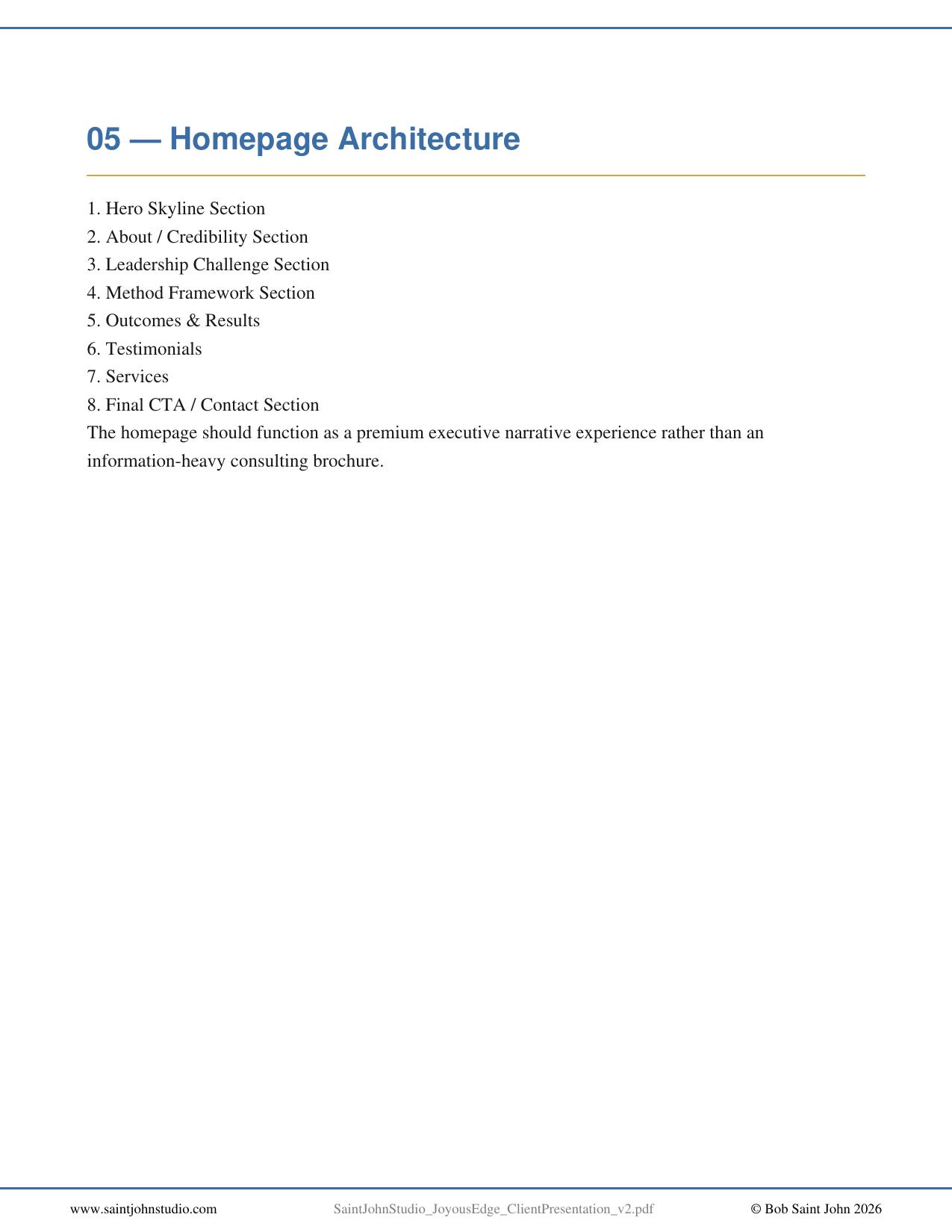
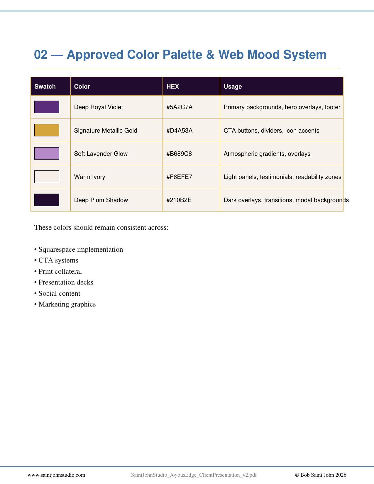
A brand system earns its keep when someone else can use it without reinventing it. The documentation gave downstream designers, developers and production partners a source of truth: what to use, how to use it, and what not to change.
The website is not the brand. It is one expression of a system that was designed first.
04 · PROCESS AS PORTFOLIO
Development can tell the story, too.
The same Story Plate system used elsewhere in the portfolio can show the arc from early brand thinking to standards, handoff and finished digital expression. That lets the development work add value without confusing it with approved authority.