GOT TO GET IN TO GET OUT
Inside the glass
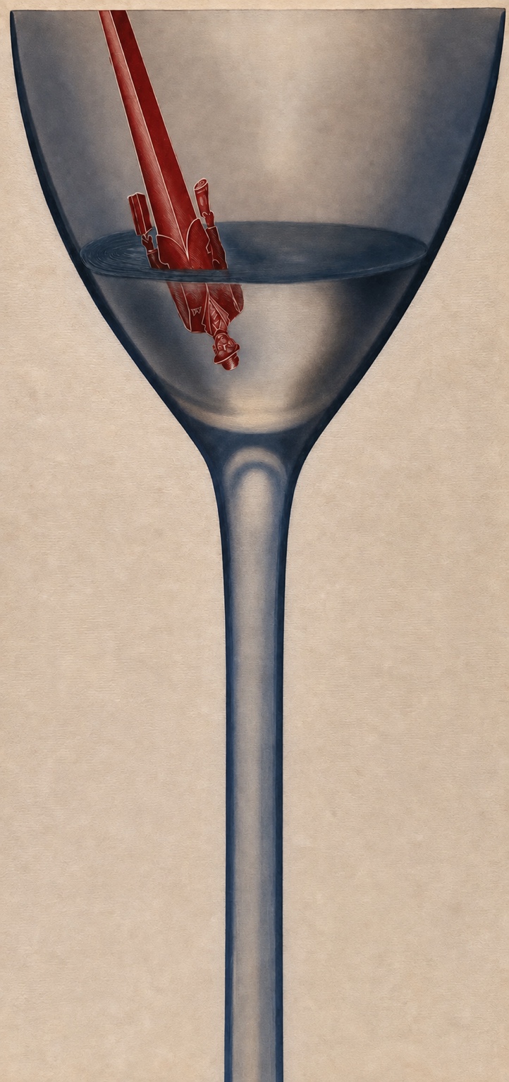
An upside-down figure disappears into the bowl of a martini glass, turning a familiar object into a visual paradox. The restrained palette and exaggerated scale let the concept do the talking.
Covers, publication systems and print production shaped through typography, sequencing, photography and disciplined craft.
Editorial illustration works best when the image carries the thought before the caption has to explain it. These two tall compositions use scale, inversion and contained worlds to turn a simple page into a visual argument.
An upside-down figure disappears into the bowl of a martini glass, turning a familiar object into a visual paradox. The restrained palette and exaggerated scale let the concept do the talking.
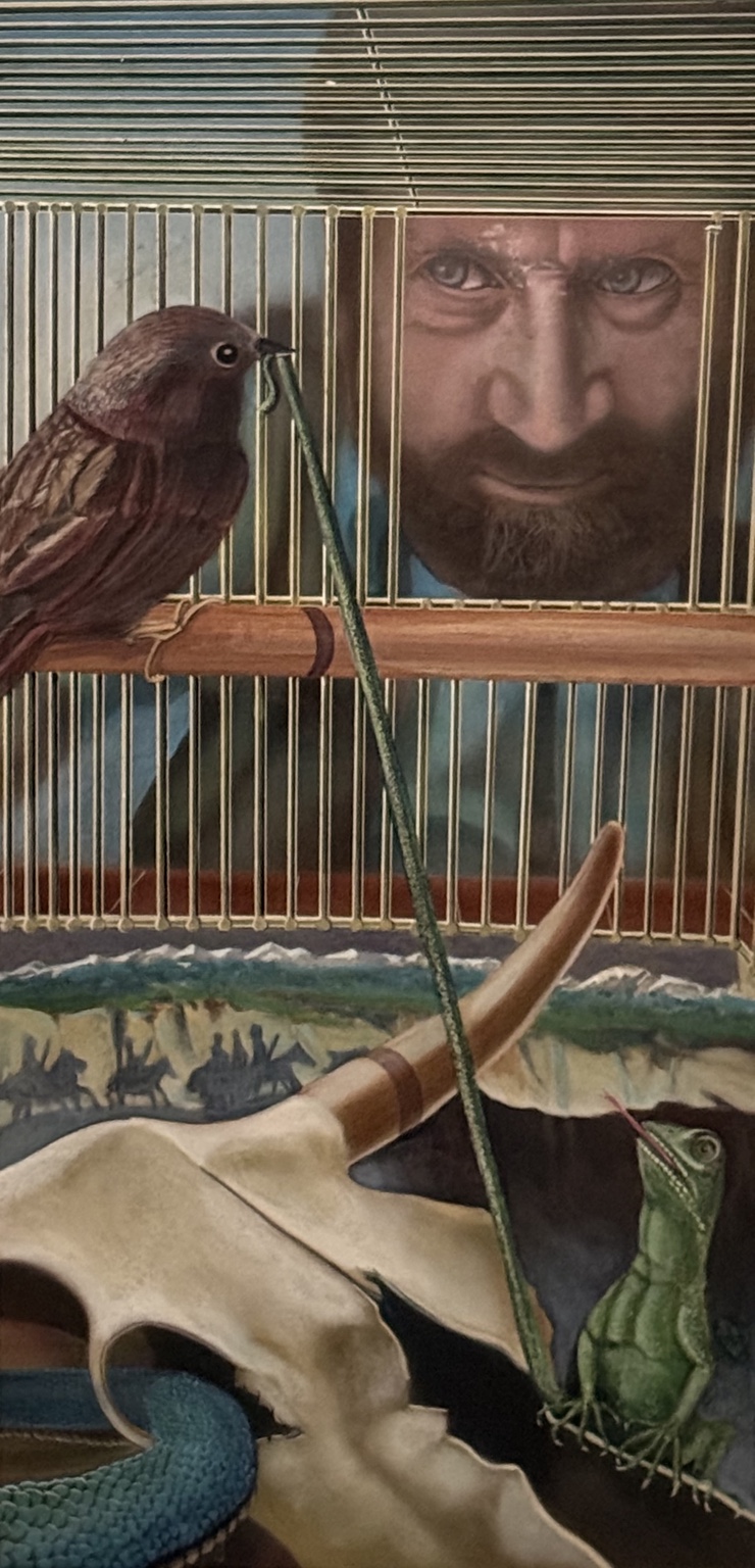
A man peers into a birdcage and finds an unexpected landscape within it. Colored pencil and acrylic washes create a contained world where observation and imagination occupy the same frame.
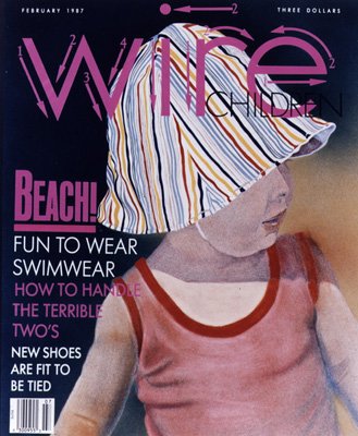
Fashion photography, hand-drawn lettering and a tightly controlled cover hierarchy built around the child’s striped hat.
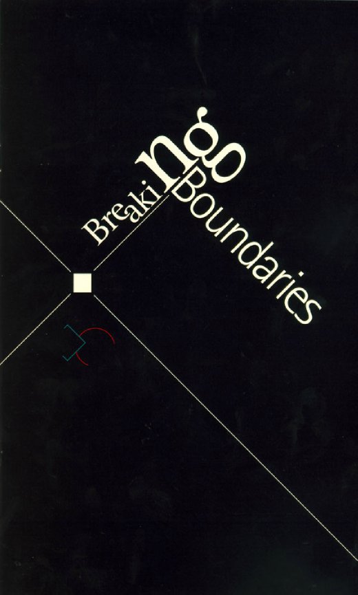
A typographic cover organized around crossing axes, scale shifts and the title literally breaking its expected boundary.
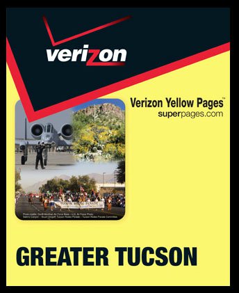
A regional publication cover using the Verizon system, local imagery and high-visibility color to create immediate recognition.
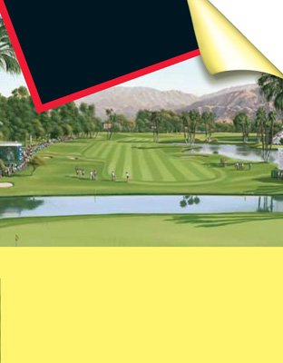
Landscape photography and generous editorial space organized within the larger publication identity.
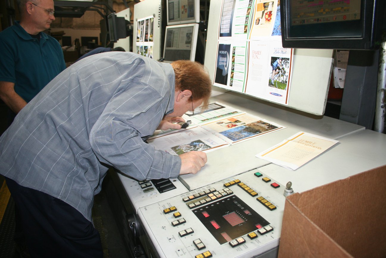
Editorial design carried through proofing, color control and final production—not abandoned at the comp stage.